

How to Use Apparel Colors to Strengthen Your Brand
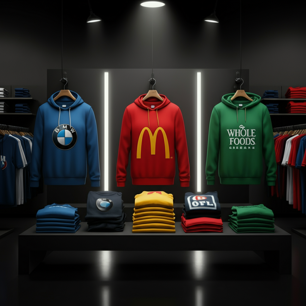
If you’re like most people—or maybe just like me—you probably associate specific colors with major brands. Think BMW (blue and white), Target (red), Whole Foods (green), or McDonald’s (gold and red)… you get the idea. Colors aren’t just visual—they tell a story and establish an immediate connection.
When it comes to branding, a color is never just a color. The shades you select should align with your brand’s identity and communicate it in clear, strategic ways. This intentionality should extend to every promotional item you use—including custom branded apparel.
Why Apparel Colors Are Key to Your Brand Identity
Apparel colors play an integral role in shaping perceptions of your brand. From creating recognition to expressing brand values, here are a few reasons why your color choices are critical:
- Visual Recognition: Research shows people often recognize colors before logos or text. A consistent use of color can increase your brand’s recall and build a sense of familiarity.
- Eliciting Emotion: The psychology of colors can evoke powerful emotions. Whether you want to convey trust, energy, creativity, or sophistication, colors do some heavy lifting in connecting with potential customers.
- Standing Out: Unique color combinations can differentiate your brand in a crowded marketplace. An unforgettable palette could be the difference between blending in and getting noticed.
- Value Communication: Colors tell a story. Bold tones might signal innovation, while softer shades could indicate approachability or care. Your apparel’s colors should convey your core values, loud and clear.
- Trend Alignment: Hopping on color trends can maximize the reach of your promotional apparel. People are more likely to wear and share items with modern, on-trend aesthetics, providing extra exposure for your brand.
The Role of Colors in Communicating Brand Personality
Colors do more than look pretty—they highlight your brand personality. With just a glance, the right colors can convey qualities like energy, sophistication, trustworthiness, or creativity.
For example, think about McDonald’s unmistakable red and yellow. These bright, vibrant colors exude energy and fun, making them the perfect fit for a family-friendly brand. On the flip side, high-end brands like Apple often favor sleek, muted tones like black, gray, and white, which suggest sophistication and innovation.
Not every color has a universal meaning (context matters), but most hues come with general cultural associations you can lean on. Looking to stand out? You can even deliberately subvert color norms to surprise and intrigue your audience, as long as it aligns with your brand’s message.
Aligning Colors With Your Audience
Choosing great apparel colors starts with knowing your audience.
Your customers’ preferences, expectations, and lifestyles should guide not just your designs but the colors you use to communicate. For example, corporate professionals may prefer neutral and minimalist tones, while creative or younger audiences might respond better to bold, playful hues.
Here’s your starting plan for audience alignment:
- Define Your Target Audience: Who are they? Think demographics, interests, and key pain points.
- Audit Their Preferences: What colors resonate with them? Trendy brights? Reliable neutrals?
- Bridge Values: Find where your audience’s likes meet your brand’s identity. For instance, if your brand is eco-friendly, earthy greens and browns can resonate with sustainably minded consumers.
When you create apparel that aligns with your audience’s preferences, you’re making it more likely that they’ll not only wear it but also share it proudly.
Matching Apparel Colors to Your Brand Palette
The foundation of any strong color strategy is consistency. To ensure your apparel aligns with your overall branding, pull from your established primary, secondary, and accent palettes. This keeps everything cohesive, from your website and logos to your custom t-shirts and tote bags.
For instance, if your brand’s primary colors are navy blue and gold, use those same shades for your apparel. Don’t just eyeball it—use specific color codes (like Pantone or HEX) to maintain accuracy in every print.
Before finalizing your design, test how the colors appear on actual apparel. A digital mockup might not fully capture how a shade looks when printed. Physical swatches or samples can help you avoid any unpleasant surprises.
Choosing the Right Color Combinations for Impact
Selecting complementary colors and impactful combinations can elevate your merchandise from “basic swag” to an item people can’t wait to wear.
Use these tips as a guide:
- Highlight Your Key Message: Use contrasting hues to draw attention to specific design elements, such as your logo or tagline.
- Limit Overload: Stick with no more than 3-4 colors per design to keep things visually appealing and cohesive.
- Follow Color Theory: If you’re unsure where to start, a designer who knows color theory can create combinations that align with your brand’s personality and values.
The right combo ensures your apparel isn’t just noticed—it’s remembered.
Testing and Refining Apparel Colors
Even with the perfect palette, testing is key. Testing ensures your designs resonate with your audience and look flawless across formats.
Steps to Refine Your Colors:
- Try Multiple Formats: Test how your colors translate across various apparel types (t-shirts, hats, and hoodies) and printing methods.
- Study Competitors: Find opportunities to differentiate yourself from competing brands. Avoid overlapping palettes to enhance your uniqueness.
- Check Accessibility: Ensure your designs meet accessibility guidelines (e.g., contrast ratios for readability).
- Gather Feedback: Use focus groups, surveys, or even team feedback to understand how your colors are perceived.
Take this feedback seriously and adjust your designs as needed to create an impactful final product.
Stand Out While Staying True to Your Industry
Many industries follow similar color trends—for example, finance brands often lean on shades of blue to convey trust and stability. While it’s okay to fit within broad industry palettes, don’t be afraid to break free and use unexpected colors to make your brand stand out.
Think of vibrant, unique shades as your competitive edge. Whether it’s eye-catching tradeshow giveaways or employee uniforms that pop, being visually distinctive elevates your brand.
Final Thoughts on Branded Apparel Colors
Your choice of colors might seem simple at first glance, but it communicates so much more than meets the eye. Thoughtfully selected apparel colors act as ambassadors for your brand, shaping how people perceive and connect with your identity.
Here’s a quick recap to ensure your branded apparel gets noticed:
- Match colors to your brand palette.
- Align with audience preferences and values.
- Pick striking combinations that leave a lasting impression.
- Test across formats and gather feedback to refine your designs.
Your promotional products are more than just free t-shirts—they’re walking advertisements with the potential to boost recognition and loyalty. Need high-quality custom apparel fast? Trust Ink Tees to print and deliver your designs exactly how you envision them.
Start creating your branded merch today!